
Case Study
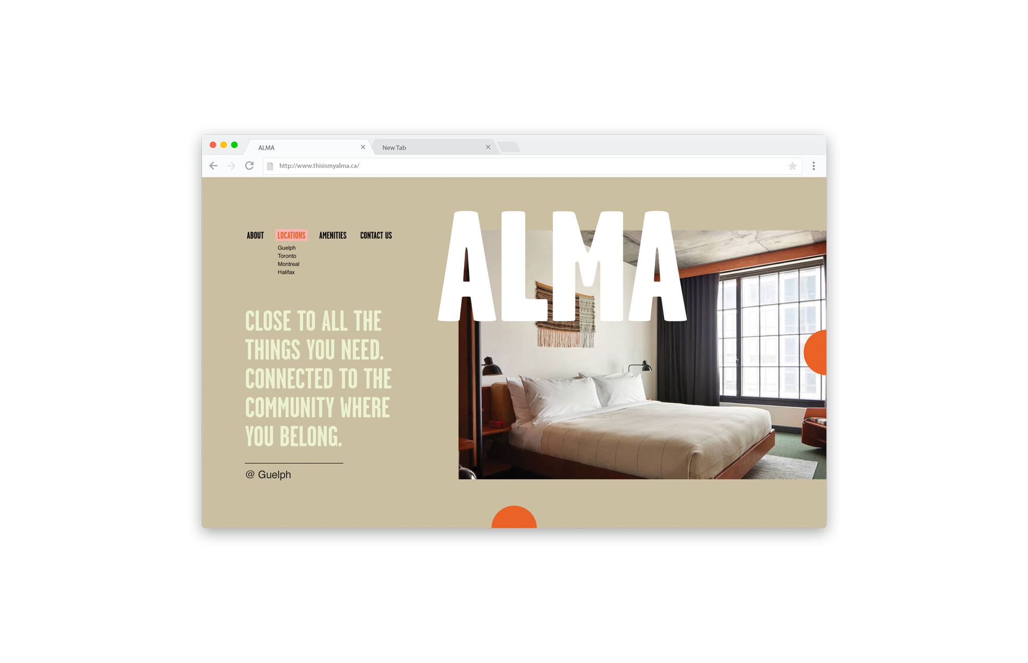
Alma
Alma stands out as a student-centered, lifestyle brand which is unique in the marketplace. We created a brand that would appeal to the target market that was vibrant and cool; unexpected in the student-living space.
The name is a contemporary interpretation of ‘Alma Mater’ for today’s university student population. The name distinguishes the brand in the student-living space. The brand is unique in the student-living landscape, as compared to comparable brands that target this demographic.
-
Guelph, Ontario
-
DesignAgency
-
Art Direction
Branding
Copy Writing
Creative Strategy (Target Audience, Themes and Creative Approach)
Naming
Photography Direction

Brand Story
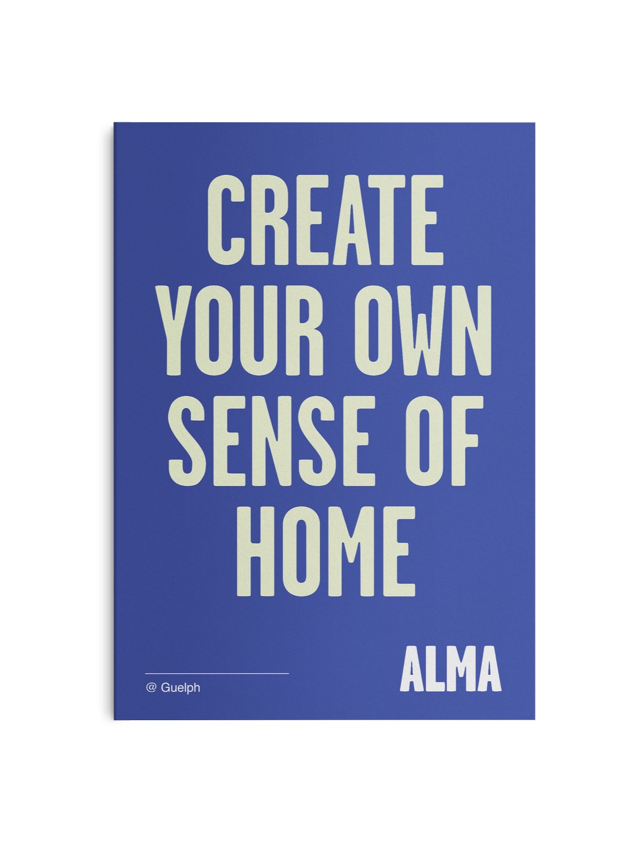
Student life should be your best life. And about living that suits you. Create your own sense of home. Follow your own style. Live with meaning and connect to the things that matter.
Alma is living curated for you. Fully furnished accommodations, high-end design and amenities in an environment designed for your best life. From a work lounge and focus rooms to social spaces and a fitness studio, we have everything you need to craft how you want to live.
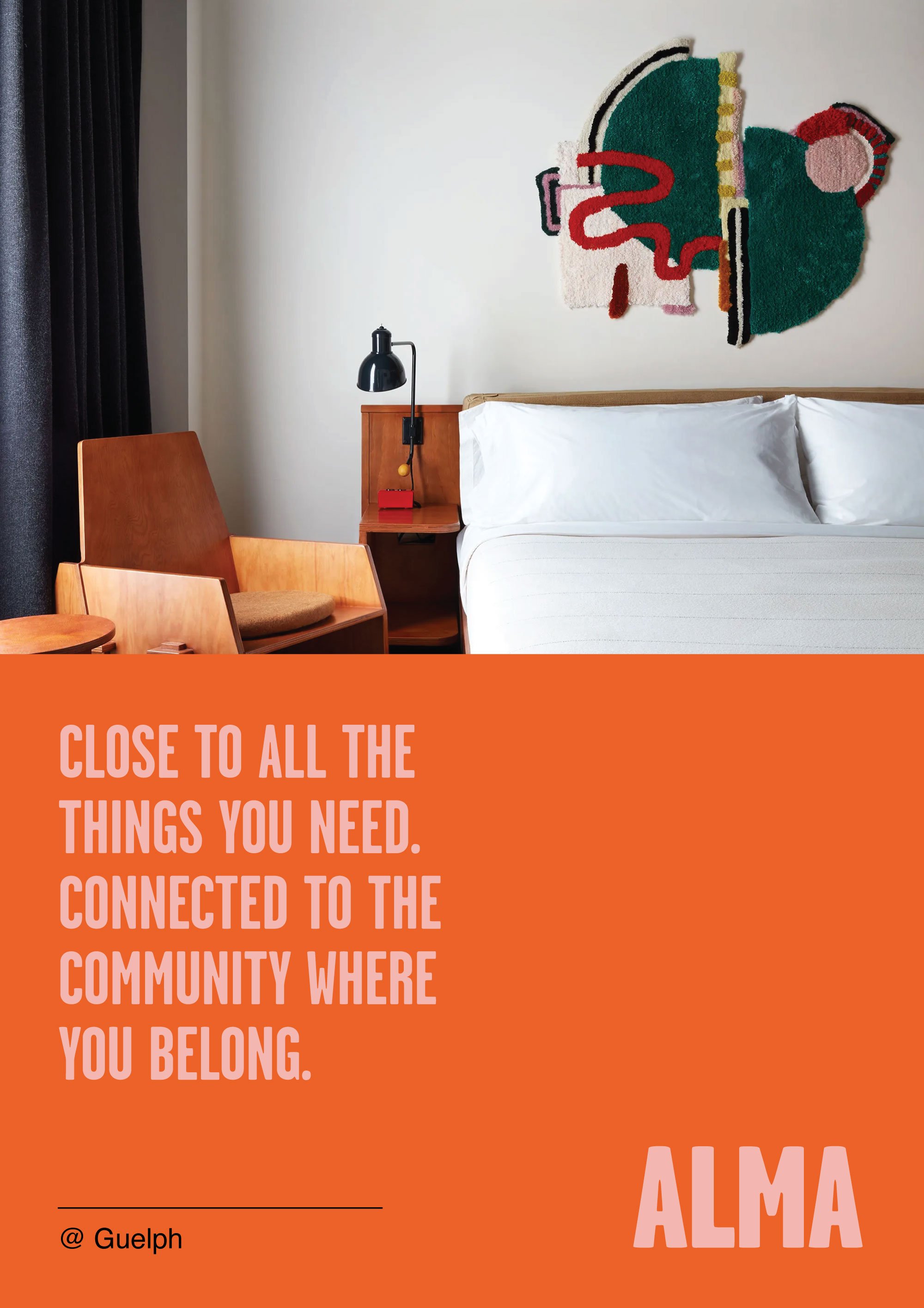
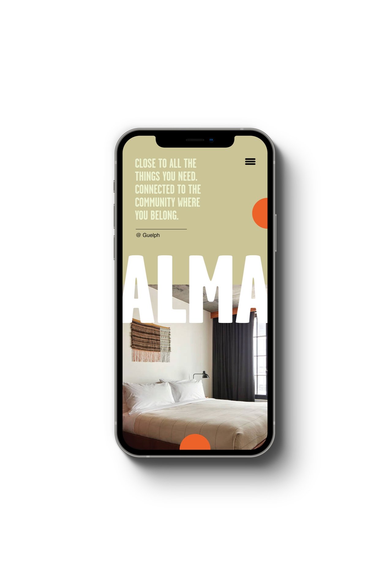
Close to all the things you need. Connected to the community where you belong.
Strategic
Direction
-
Collegiate Comfort:
Confident
Classic with an edge
Playful, broad appeal
-
Playful, broad appeal
Memorable and recognizable
Confident
Combines energy/confident with classic/calm
-
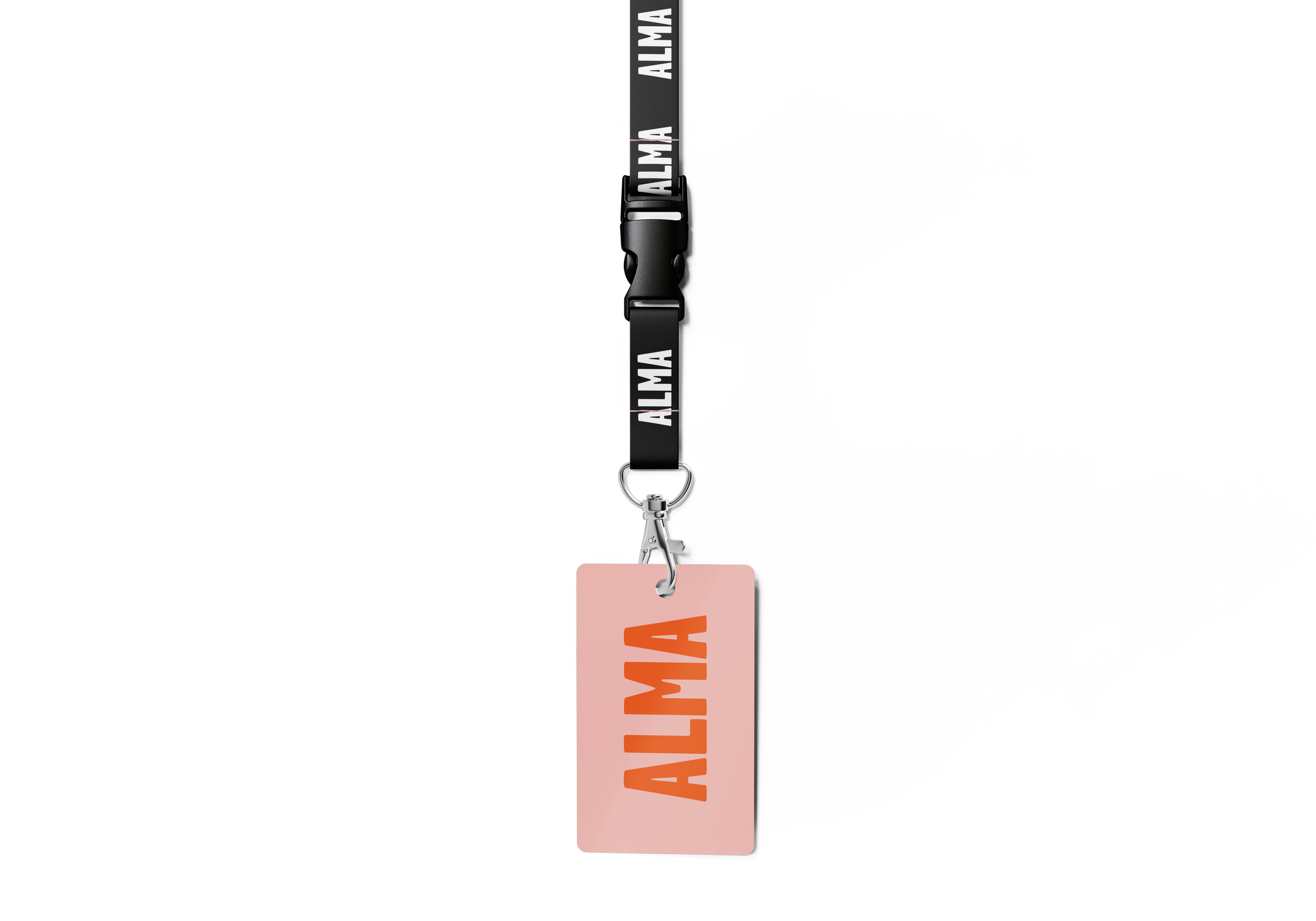
All caps logo is a strong and confident logo. Combination of this heavy stroke weight with the all caps logo conveys a bold, clear, highly visible logo.
The characters feel strong with a sense of rootedness.
-
Colourful and confident — energy + warmth.
Orange and blue are traditionally collegiate but we’ve balanced the dominant brand colours with softer hues in the secondary palette.
By pairing the primary brand colours with lighter secondary colours (sweet, mint, latte) the palette is supported and becomes contemporary.
-
Crisp, slightly serifed, condensed bold font for headers is confident and bold. Clean classic, Helvetica typeface for secondary and body copy.